United Label often works with manufacturers and brands in the later stages of their retail path; that is, after the product packaging and label have been designed, but before its been shipped out to stores. Because of this, we understand how important it is to get the first part of that process right–because a poor package design cannot be fixed by even the best label. That’s why, in this article, we talk about what makes a product stand out on supermarket shelves (although you can apply this knowledge to just about any product category).
Fundamentals of Product Design
Poor product design can make customers think your product is not made for them. Even if you keep your design simple and find something good in your product, a bad design will not attract anyone. To keep your designs simple and striking, use fewer colors, minimize graphics and labels, and your design should have a clear message.
Whether your product will be available at a grocery store, boutique or the latest gadget at Best Buy, the right packaging is a critical step in your marketing process. Using a cheap, generic design for your packaging is a safe way to make people doubt your product. On the other hand, by choosing high-quality packaging designs that tell them what is high-quality inside, customers will be more confident in making a purchase.
For customers, packaging and labels are often the first introduction to your product and your business. This requires a clear understanding of who you are and what you can offer.
Product Design & Demographic Targeting
No matter what your product cateogry is–from toothbrushes to shoes to nutraceuticals–you must ensure that your packaging caters to the right demographic. When choosing the packaging and design for your product, focus on ensuring that your design is relevant to your product. In addition, you want to make something unique.
In the competitive retail world, your product needs to distinguish itself from the other products on the shelf and attract customers. It must make itself special and deserve the attention of the buyers. The retail market is competitive, and if your product stands out, you have something special.
Eye-Catching Packaging Doesn’t Necessarily Mean Flashy
This can happen when you take a bold step, such as choosing eye-catching black packaging (when competitors use plastic bottles) or striking by putting your product in a can, cardboard box, stand-up bag, etc. By simplifying your packaging, you can showcase your competitive advantage and demonstrate the value of your products.
Unexpected packaging can help your product present originality. Brands that want to generate excitement with their packaging must be brave enough to try something new and break a few rules. Since trying to grab shoppers’ attention with something bright and eye-catching is no different from going in the opposite direction, minimalist packaging designs with more subtle graphics are a popular trend that shoppers will appreciate seeing on noisy store shelves. Plain packaging tells people you don’t need flash to sell your product–it’s just that good.
When designing packaging, consider the demographics of your target market. For example, if your product is aimed at the over-60s, it could have an impact on design, font size and legibility.
Colors
When you design a package, the colors you choose can make a huge difference in how your customers perceive your product. The psychology of color has been extensively studied, and most studies conclude that different colors have different effects on human emotions (see this article for more on colors in packaging).
When choosing colors for your product packaging, choose colors that represent the mood and emotions that you want to associate with your product: for example, fun, child-friendly, healthy and relaxing (or elegant, formal, and serious). When designing the packaging for your products, remember what the colors you use say and send a message to your customers. If your product is bold, lively, restrained, or refreshing, it is important to choose shades that convey this to customers.
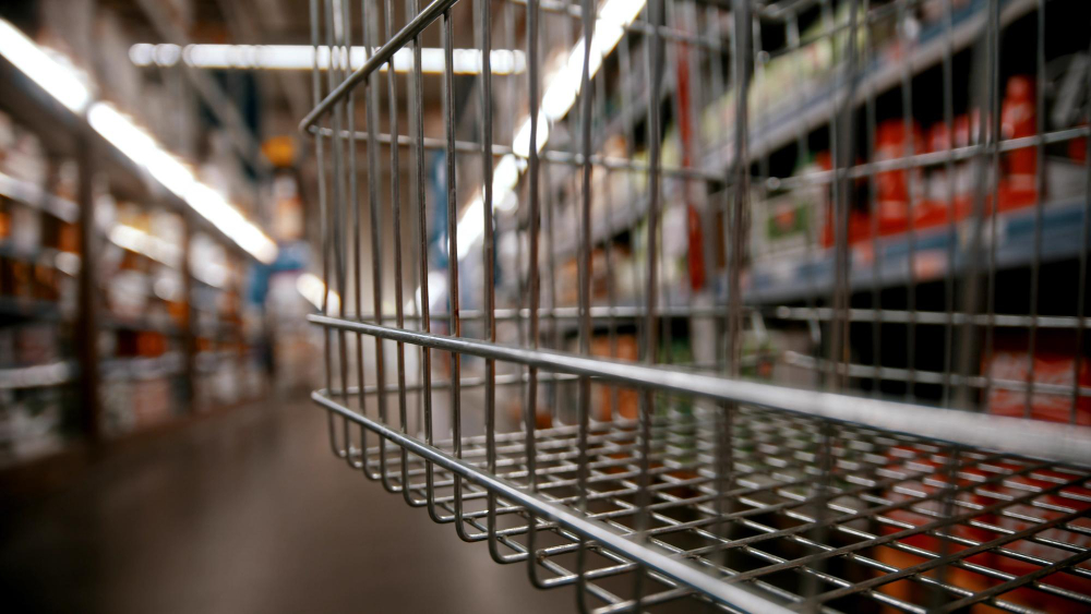
The Supermarket Shelf
For aspiring food and beverage brands, jumping on food shelves can be an intimidating but necessary step for their products. Getting into the supermarket aisles expands a brand’s potential customer base and increases its potential sales potential.
However, there is more to earning coveted shelf space than many merchandisers realize, so they are unprepared when it’s time to turn the pitch into grocery stores for their products. To impress retailers and keep them clamoring for your product on the shelf, you need to explore the retailer, its typical consumer corner and niche before pitching, determine what sets your product apart from the rest and how to align your product with retail business objectives.
Remember, when customers start to ask for your product, retailers will be happy to give you top shelf placement. And when you’re ready to print your bold, flashy, unique, or minimalist labels, give United Label a call at 973-589-6500.