Although you may not be thinking about it every day, your brain has emotional reactions to the colors you perceive in the world. In the business world, this has enormous ramifications for how you develop your brand, from what colors you use in your logo, to how you utilize colors on your website. Marketers have known about the significant effects and benefits of strategic color use for a long time, and have been taking advantage of this fact in every piece of marketing material they release. In this article, the label experts at United Label in New Jersey are going to look at how color affects people psychologically and emotionally, and some of the best ways to use color when designing a label for their product.
The Power of Color 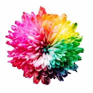
First off, let’s look at what color is, and what it does. Your brain perceives color when certain wavelengths of light bounce off an object and enter the human eye. Higher wavelengths are blues and purples, while lower wavelengths are red. Outside of this range, however, the light can’t be seen (thus, infrared light is lower wavelength than red, and ultraviolet light is too high). Ironically, the “color” you perceive an object to be isn’t actually innate to the it; rather, it’s the wavelength that is not absorbed by the object that you see.
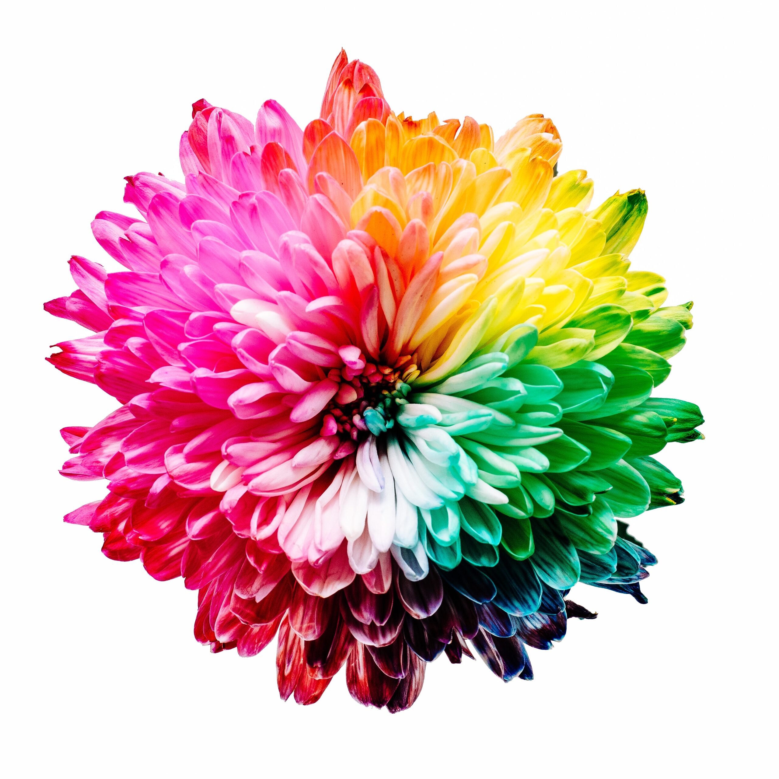
In any case, we know that different colors affect people’s moods and emotions in different ways, and there have been countless interpretations and applications throughout history. In alternative medicine, for example, the color blue is associated with pain relief, while yellow is purifying. Red stimulates the body and blood flow, while orange can provide energy.
But when it comes to marketing and business, color psychology has a much more specific intention, and that’s to gain people’s attention and encourage them to consider purchasing a product. While we could write an entire book on the subject, here’s a brief outline of what some colors invoke in viewers:
- Black: sophistication, power, elegance
- White: minimalism, simplicity, purity
- Green: nature, soothing, relaxation, harmony, as well as money
- Orange: enthusiasm, energy, youthfulness, creativity
- Pink: romance, play, femininity, sensitivity, tenderness
- Red: passion, heat, and energy, but also danger
- Yellow: hope, joy, smiles, sunlight
- Brown: warmth, honesty, wholesomeness, stability
- Purple: mystery, spirituality, luxury, royalty
- Blue: calm, serenity, coolness, as well as power.
- Grey: formal, conservative, maturity, responsibility
Of all those listed above, blue is perhaps the most popular color in the world, not only for people’s favorite color, but also for business logos. Many of the largest companies in the world use blue in their logo, in fact. On the other hand, brown is not used in logos very much at all. However, the versatility of black makes it the color most often used in graphic design, as it can be combined with any color and still look great.
Strategies for Using Color in Your Label Design

Based on the information above, you may be tempted to go out and design a bright, multi-hued label for your product—but that’s not necessarily the right approach. Consider carefully what kind of product you have, and the history of the industry: is there typically a lot of color, or is it generally grey and monochromatic? For example, in the late 90s, Apple launched a series of computers with bright colors called the iMac, and it was specifically aimed at youth consumers. It was a far cry from the usual white and grey technology world, and it was a success—but that may not be the right strategy for you.
If your product tends to be conservative and unexciting, maybe just a splash of the right color is enough for your label. That being said, however, you may decide that more color will make your product stand out against the competition.
We do recommend that as you get into the nitty-gritty details of your color project, consider hiring a professional designer to at least review your logo. They will know about color specifics beyond the scope of this article; for example, the Bezold effect (incidentally, this is an optical illusion where the lightness and darkness of the outline effects how the color is perceived).
One thing to consider is that color trends come and go, and the beauty of working with a dynamic, quick-turn-around digital printing experts United Label is that you can order and receive a new label in no time at all. Thus, you can experiment with different colors for each run, eventually finding the design that suits your product best.
In the long run, however, you’ll want to stick with your color and allow it to generate a lasting impact in your consumers’ minds. For example, Coca-Cola is known for red, mention UPS and you might think of brown, and McDonald’s, well, they call it the “golden” arches. In the luxury category, too, Tiffany’s has their robin egg blue box, while Christian Louboutin shoes all have a signature bright red sole. These colors signify a certain status.
What to Do Next
Once you are ready to start designing your label, the next step is to reach out the digital label experts at United Label. We have expertise in label design as well as manufacturing, and can help ensure your labels are not only great-looking, but suitable for printing as well. We are here to help you get your labels done quickly, easily, and affordably—call us today at (973) 589-6500 to get started.